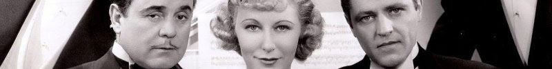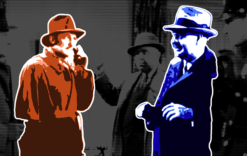

This was one of two dozen movies in the Lone Wolf series. They cranked them out pretty quickly. This is the second of three released in 1940. It’s a low budget, shot on the lot, light bit of escapism, the kind where a woman’s supposedly dead husband reappears and gets shot in front of her, and she’s completely fine five minutes later. Goes down easy.

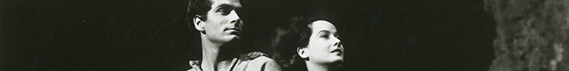
Jean Muir, the titular Lady, was known for being a troublemaker because she would do things like ask questions, or not dress up in public, or (worst of all) “support unions.” She was blacklisted in 1950 for supposed communist activity (though she was never a communist) and couldn’t get acting work for eight years.
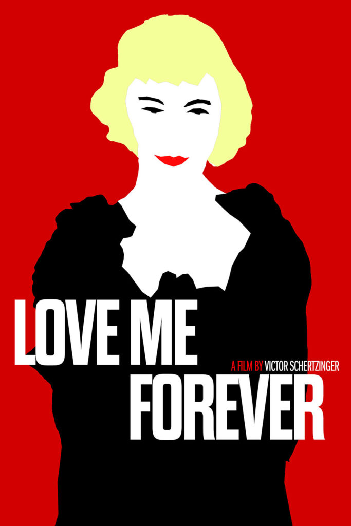
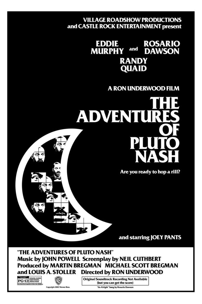
The problem with today’s fake poster is that the original is deceptively simple, which means anything off really sticks out.