This is the first of this year’s Stephen King Perambulation Pictures- The Running Man comes out in November.
What I don’t understand about this movie: they know they can’t stop for any reason, not even to go to the bathroom. So why are they all wearing normal pants? If I were doing this I’d wear a kilt regimental style.
Also: If I were doing this I would die.
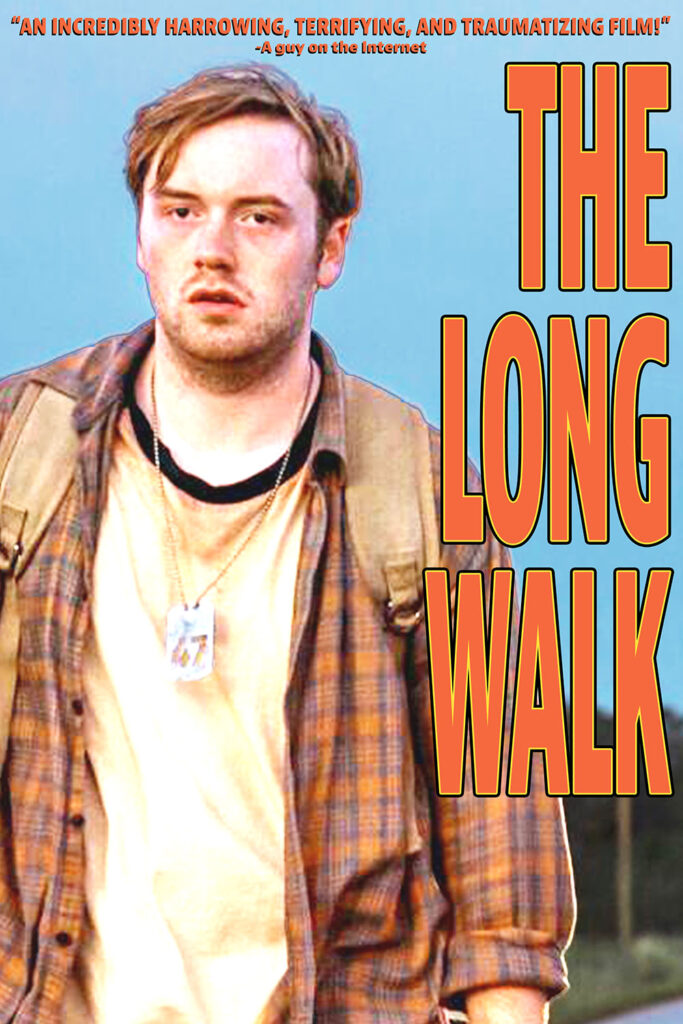
I think this is a good idea for a fake poster, but I’ve got a cold coming on and my body seems to think going to bed would be a better use of my time than making a poster that only four people will see, so you get this proof of concept:
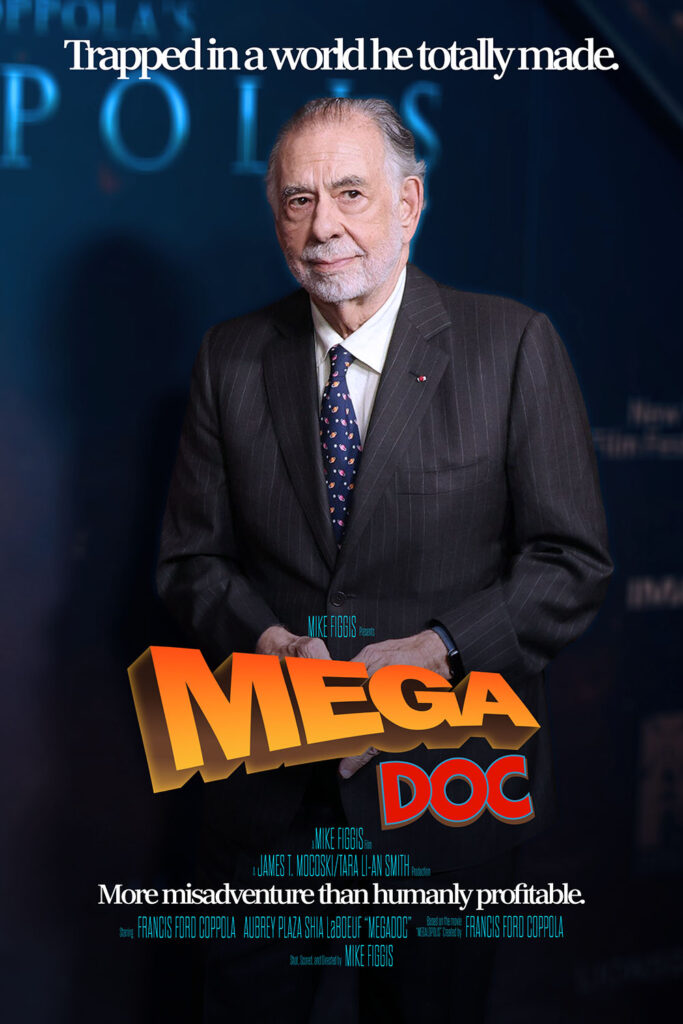
More than once during this Mike Figgis says something like “when you make a documentary it’s always more interesting when there’s a disaster.” I guess things worked out for him.
The most interesting thing about this is the archival footage going back a quarter century of different actors reading the script and doing test shots. This could have been a Ryan Gosling/Uma Thurman movie!
Also: Shia LaBeouf has a bad reputation, and does nothing to challenge that here.
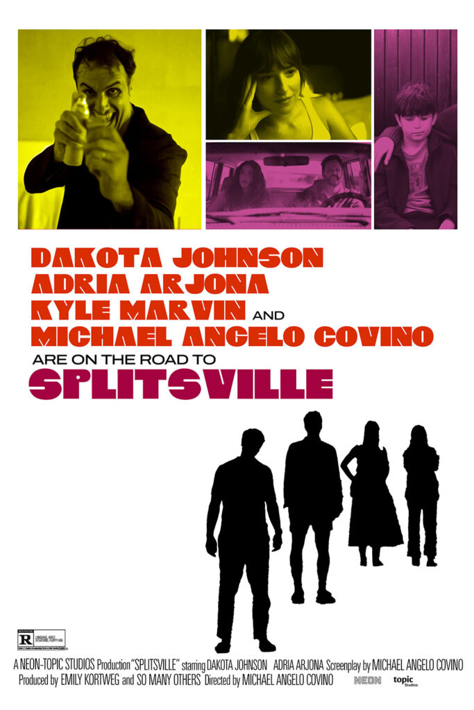
Today’s fake poster comes from a different movie fiasco.
This was fun, but once again I must ask: writer/directors, please stop casting yourselves as leads.
This fake poster was motivated by nothing but the fact that I liked the font on the original but couldn’t find anything that resembled it. So I made my own. It’s only letters right now, and the spacing is a little weird, but it works!
Seriously, that font rips.
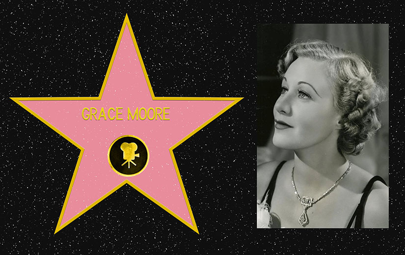
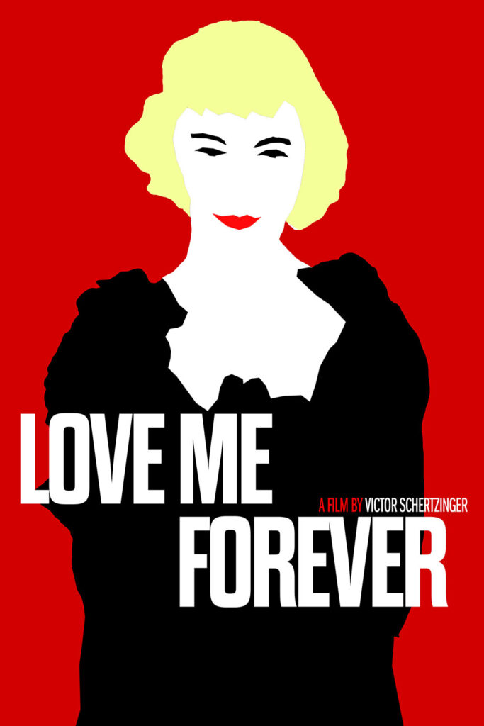
Love Me Forever
I watched this because it was the only Grace Moore movie I could find. She was an opera singer turned actress, so naturally she plays a woman who just happens to be really good at singing opera. She’s fine, but Leo Carrillo (who I honestly only knew from the beach named after him) is way more fun to watch.
This poster continues my current “one good one, one bad one” pattern. This was a good idea, but the execution is weak.
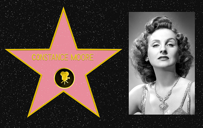
Bonus Walk of Fame Thing!
One of the walk of fame stars is for Frank Fay. He is credited as the creator of modern standup comedy and the entertainment job of emcee. He was also a racist, fascist, antisemitic, egotistical ass, so I went out of my way to watch enough of him to say “I saw him on film” without having to sit through a real performance. I found a twenty minute promotional film with tons of stars called The Stolen Jools. Fay is in it for about ten seconds, and that’s plenty for me. And no star for him, either.
This is going to get a little spoilery. You have been warned.
This wasn’t based on a play, but it sure felt like it was when it started.
Also: if you’re making a grounded movie about three daughters fighting to resolve their differences while dealing with their dying father, and our only way of knowing he’s even there is the beep of a heart monitor in the other room, maybe don’t have him show up in nearly the last scene and give a show stopping surreal performance that blunts all the growth the characters have gone through over the last two hours.
I looked this up on Letterboxd, saw that it had a 3.7 rating out of five, and decided it was worth watching. About halfway in I was so bored that I looked it up again, and learned that its number are probably artificially inflated by sharing the name of a popular TV series. I WUZ HOODWINKED, I TELL YA!
I chose this movie because I was looking for something with Constance Moore I could watch for free. She had pretty high billing, but she only has a couple of scenes at the beginning of the movie, and in the middle we find out that she was killed off-screen. I almost expected a scribbled card reading “POOCHIE DIED ON HIS WAY HOME” to pop up.
…and to finish off this turd fest: I couldn’t figure out a decent parody poster, and there were pretty much no decent pictures from the movie. And that’s why today’s poster is a halfass reference to the poster for “Ernest Goes to Jail.” The only thing that’s close to the original poster is the lettering.
I watched this for tonight’s episode of Flop TV. It probably would have been a better movie if it had been made with no stars or cash. I wonder how much of the $100 million budget went to celebrity paychecks.
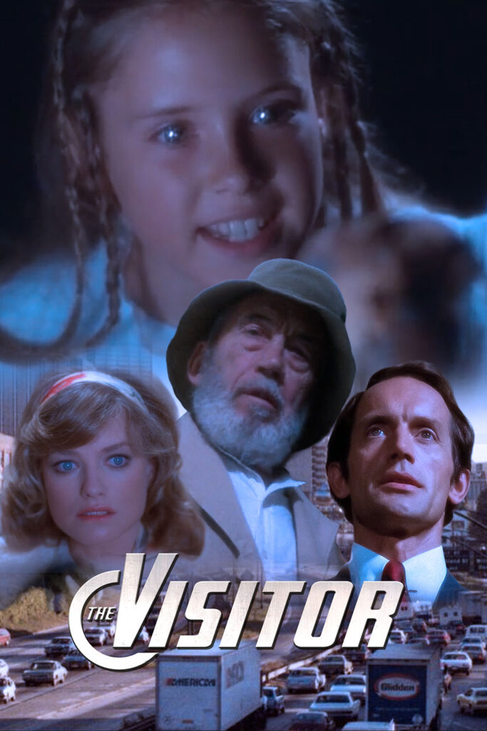
Today’s fake poster is OH SO MUCH BETTER than the thing I farted out yesterday, but based on an old poster that I’m guessing most people wouldn’t recognize. PROVE ME WRONG, I DARE YOU!
I knew I was in for a high quality piece of cinema when it opened with this title card:
“Spelling? Capitalization? Grammar? Punctuation? Those rules are for cowards.”
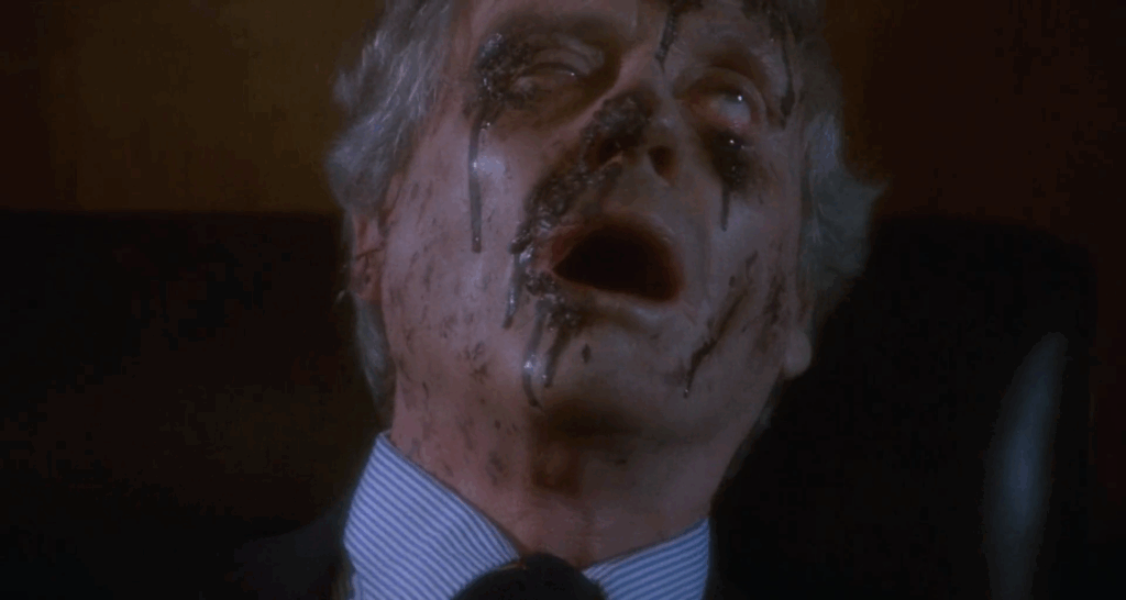
This is the best movie with an old man in a fishing hat fighting to stop an eight year old girl from forcing her mother (with the help of a secret evil organization and the owner of a basketball team) to give birth to the reincarnation of Space Satan I’ve ever seen. At that doesn’t even mention the ice skating fight, or the commune full of bald children led by Space Jesus in what looks like a very nice suburban home in space.
Mel Ferrer (Walk of Fame star at 6268 Hollywood Boulevard) plays the head of the evil secret organization. He gets killed by birds. I’m not sure if he’s covered in blood or bird crap.
Today’s fake poster… isn’t very good. It looks less like a movie poster, and more like a repackaged DVD in the five dollar bin at Walmart.
After I saw this I heard some people outside the theater complaining that there was too much setup and flashback and not enough fighting- which is weird, because the whole point of this movie is that this couple is actually deeply in love, but they’re terrible at it.
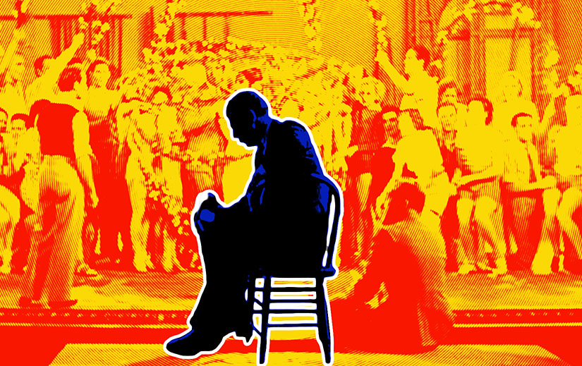
Today’s poster inspiration was an obvious choice for fans of late seventies Bette Midler.
Some things that never happen in real life that happen for extra drama in this movie:
The director is backstage on opening night, still directing
The main backer threatens to pull out of the show the night before opening, when things are already paid for
There is no understudy for the lead role
The most amazing thing about this movie: it doesn’t end when the chorus girl finishes her triumphant performance. In the last scene (and yes, I’m about to spoil the ending of a 92 year old movie) the director, who has worked himself nearly to death to complete the play and secure his future, stands outside the theater. Weak and unrecognized, people pass him saying that he deserves no credit and that the chorus girl is the reason the show works. And then the credits roll! Way darker than I ‘d expect, but maybe Depression era audiences were primed for that little gut punch.
And why does this movie hate Philadelphia?
I’m not sure exactly where Una Merle’s star is. The Walk of Fame directory says 6262 Hollywood Boulevard, but Wikipedia claims 6230. I guess I’ll have to go look.
It looks like the poster I copied for this was a linocut, and I wasn’t up for spending a day or two replicating the effect accurately, so I faked it. Close enough if you don’t look too hard.