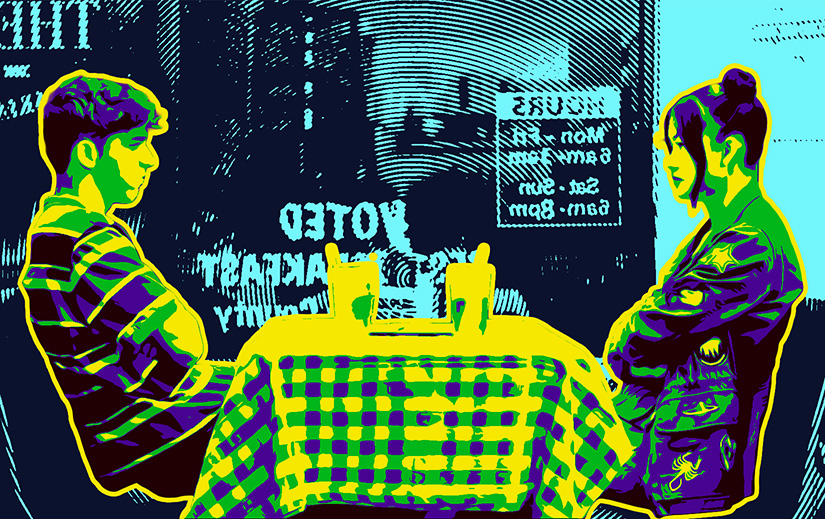
What if you remade The Mitchells vs. The Machines, but live action, and slightly more about LGBT and identity issues, and with high school friends instead of a family, and also no machines?
A light, sweet, pretty by-the-numbers high school buddy rom-com that is probably much more interesting for people one quarter of my age.
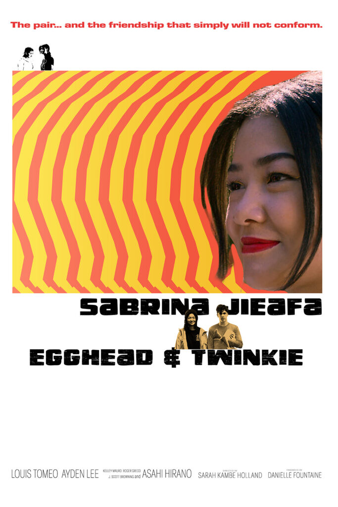
What’s the link between this movie and the source of the poster to mimic? EGGS!
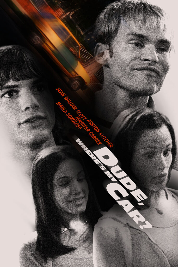
When this movie came out I was 34 years old, and I was sure I wouldn’t like it, so I didn’t see it. Today my spouse watched it for thing she’s doing, so I decided to watch it with her.
Yeah, 34 year old me made the right decision. This movie’s terrible. I couldn’t tell you how many times the whole joke was “what if we kept repeating this?”
Maybe the problem is the rating; A stoners and boobs comedy that’s rated PG-13 is a movie that’s been gutted by a studio that wants to market it to the widest group possible is naturally going to struggle.
Or maybe it just sucks.
Today’s fake poster is based on a different car movie that I’ve never watched.
…but I bet it’s better than Dude, Where’s my Car?.
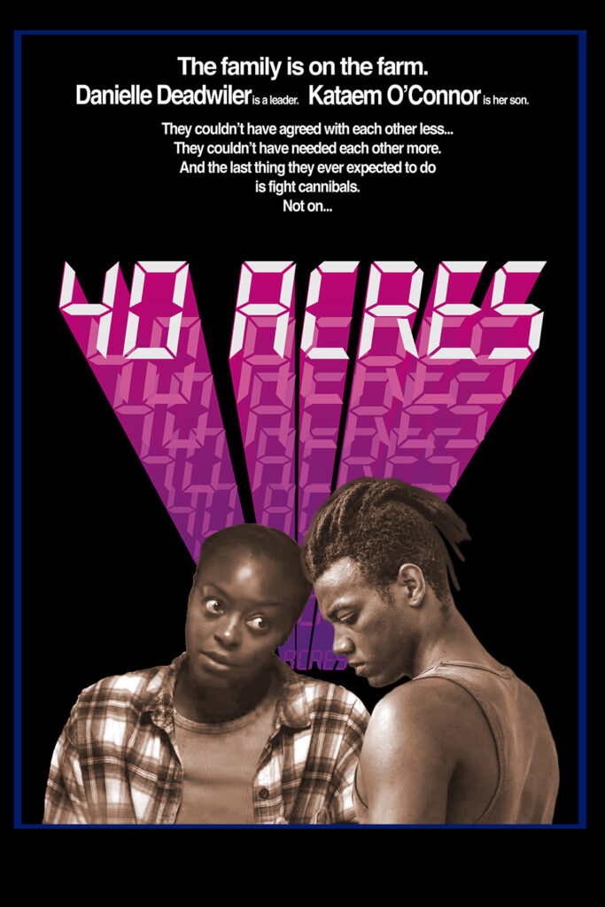
When a suspense/horror/apocalypse movie is really good you ignore all the details that don’t make sense. That said:
The whole plot is based on a disease that kills 98% of all edible plants, which causes the death of all animals. But the forest looks great! What happened to the animals that eat forest plants? How is the forest not completely out of balance? What about insects? If the trees are alive, should insects that eat wood be having a field day? And then wouldn’t animals that eat insects also be having a grand old time?
And where do they get gas?
And the farm has been turned into a heavily monitored fortress. How?
And the electric fence can be disabled by breaking a junction box that’s unlocked and in plain sight on the fence! How is that useful?
And I won’t spoil the fight scene at the end that is so dumb that it hurts.
Even with all this, the movie is still okay. But if the story was just a little stronger I wouldn’t have cared about the billions of plot holes.
The big link between this movie and the movie the fake poster is based on: their titles both start with a number in the forties.
I watched this because it was a pick on the Screen Drafts “Action Comedy” episode. It’s really fun- very much a live action martial arts version of a Warner Brothers cartoon. I was a little put off by a bit of homophobia, but other than that it was pretty darn good.
Today’s fake poster once again has almost nothing to do with the poster it’s copying, but they both feature someone smoking. That’s something, right?
A side note: I think I finally fixed the way these posts are showing up on Mastodon. We’ll all know when I hit the publish button!
Watched as prep for The Flop House. I try to do my homework!
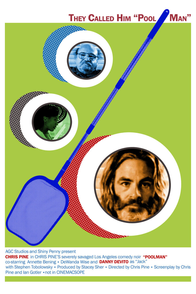
This movie got hammered by critics like it was made of cancer and strangled kittens, and I don’t think it’s anywhere near that level of nightmare. It constantly almost works. There are details I love, like his “Walkman”: a COBY knockoff with big elementary school headphones (I see you, Califone 2924AVs). But Pine lets too many of his influences take over instead of using them as a lens for his own style. But it’s is first shot at directing; I would not be surprised at all if there are Chris Pine directing retrospectives in the future (where Poolman is called “critically misunderstood”).
Or he might become Neil Breen. Who knows?
Today’s poster: A movie called “Poolman” gets a pool movie poster.
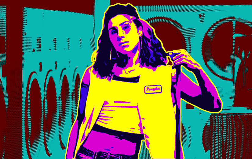
There’s a lot of good stuff in this, but it gives Ponyboi too many problems to deal with. I’m sure the effect is supposed to be a constant heightening of tension, but it felt more like trying to cram every possible neo-noir cliché into a single story.
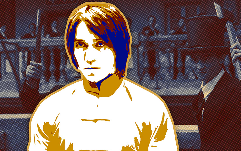
Bonus: Ponyboi (2019)
I didn’t realize until I got home that the movie is adapted from a short film River Gallo made in 2019. It’s on Vimeo. The short is less polished than the movie, but the story is more focused. Almost every line from the short is in the movie, but some are shuffled to new characters. The last scene is similar to the last one in the movie, but it’s much more connected to the rest of the story.
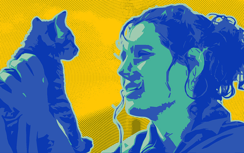
A movie about recovering from sexual assault that somehow manages to acknowledge the seriousness of the crime even while it inserts comedy. I liked it muchly.
Today’s fake poster is based on a very different baby movie.
But the question is: did I fix how the blog posts to the Fediverse? We’re about to find out!