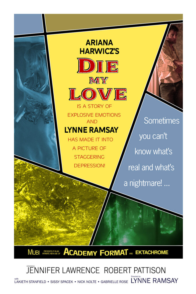
Jennifer Lawrence is really good at finding projects that give her new ways to be miserable. She’s also really good at playing those parts, so it all works out.
Good Golly, it’s a fake poster!
Jennifer Lawrence is really good at finding projects that give her new ways to be miserable. She’s also really good at playing those parts, so it all works out.
Good Golly, it’s a fake poster!


The hero of this movie is a screenwriter who’s a better detective than the cops, contaminates evidence without consequence, solves the crime, and gets the girl. These days he’d be called a Mary Sue (or maybe a Gary Stu).
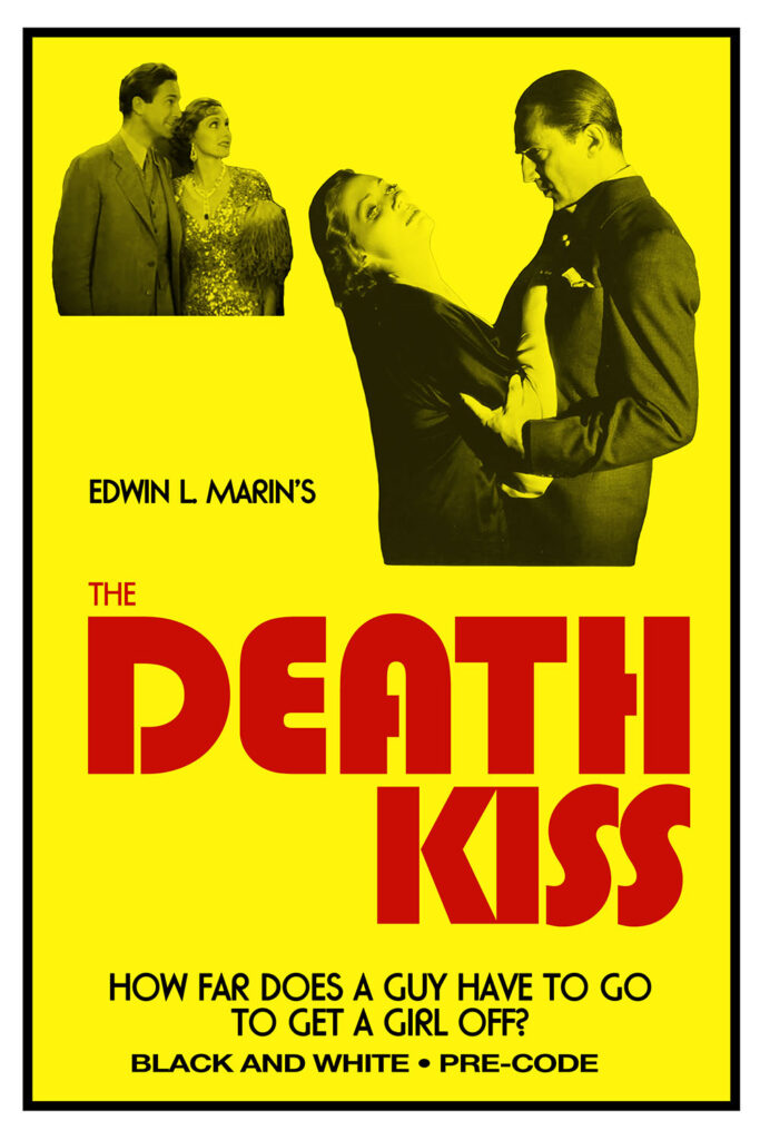
It’s not a great movie, but it’s fun to see three of the leads from Dracula in wildly different roles.

Adrienne Ames (1612 Vine Street) plays the main suspect, an actress who was recently divorced from the murder victim. In real life she had already been divorced twice, even though she was only in her early twenties. Her first marriage happened when she was 13 or 14. Gross.
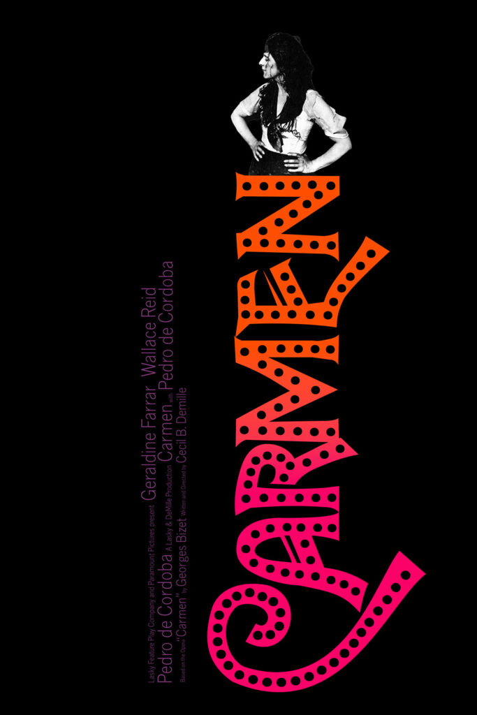
Today’s fake poster isn’t very complex, but it did amuse me.


This gets a little fawning, but how could it not? It’s about Kathleen Hanna, a prime architect of everything cool in the 90s. My biggest complaint: They never revealed if Le Tigre was named after the knockoff Izod shirt that J. C. Penney used to sell.
Today’s fake poster was almost based on The Wedding Singer, but I liked this one more.


There’s something funny about making a silent movie based on an opera…
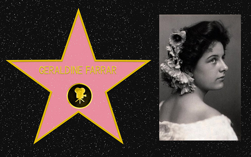
…and it’s funnier when you cast an opera singer as the lead. That’s a little unfair: Geraldine Farrar (1620 Vine Street) was popular enough to have her own version of Swifties.
Today’s poster is based on a different staged music production that was made into a movie.


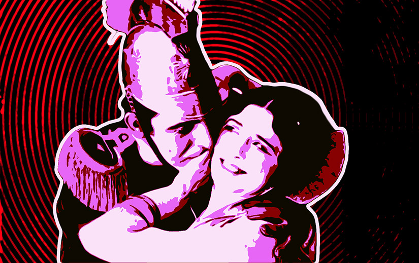
It’s not subtle. At one point a character has a line that might as well have started with “And now I shall state the moral of the film.” Also: I learned that adding enough electricity to properly connected parts of dead bodies can create Wolverine powers.
Also: At one point Dr. Frankenstein mentions that The Creature will need to be huge to make the work easier, and I half expected Teri Garr to pop in and say “He would have an enormous schwanzstucker!”
This is my 200th fake poster!


Still holds up.
The science makes no sense, but this movie’s really a fantasy story so that’s okay. Still weird that Marty’s mom has a little chuckle over the guy waxing her car being the guy who sexually assaulted her in high school, though.
I used the Back to the Future poster for a movie earlier this year, so it seems right to go the other way for this fake poster:


This is the worst movie I’ve seen all year (sorry, Star Trek: Section 31. You don’t even get to be at the top of the worst list any more).
Some people love this movie. They call it anti-art or meta-cinema, and I can see someone having that take, but when does something move from absurdist meta-commentary to stale and unwatchable?
I figured out what this feels like. Sometimes musicians start out with zero money and make great music with bad equipment and no budget because they’re driven and talented. Then they start making money, their technical skills and instruments get better, the music gets more polished and generic, and they get accused of “selling out.” So they decide to go back to basics, get out their old crappy instruments, and make an album “like they used to do it.” And it sounds fake, because they know too much and can’t do it the way they used to do it.
Are there good performances? Sure. Whole scenes, even some whole stories work. But most of it was three hours (THREE HOURS) of barely watchable stories full of (intentionally bad) AI generated graphics and (fake) AI written stories.
I’ve hear that “bad” art makes you think more than “good” art. If that’s true, congratulations Dracula: you made me think a lot.


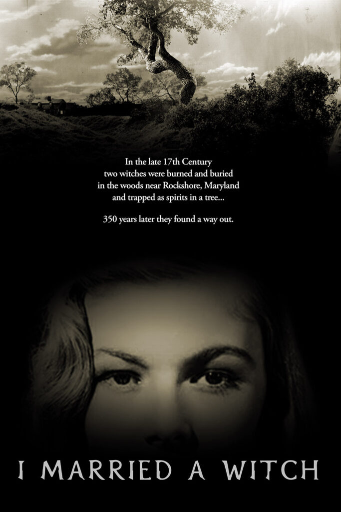
When the witch is Veronica Lake, of course you marry her.

Here’s some bad luck that messed with the legacy of Fredric March (1620 Vine Street): He was once part of a group at school called the Ku Klux Klan- but it was a student honor society, completely unrelated to the infamous Klan, that was founded before the Klan had a significant presence. The student group changed their name when the bad Klan gained notoriety, but when the original name was discovered people thought March had been racist. In fact, March worked with the NAACP and other civil rights organizations for a half century.
Witches? Significant trees? Maryland? Today’s fake poster was practically begging to be made.


Not as Yorgos as you might expect, until it becomes exactly as much Yorgos as you’d expect.
Here’s your fake poster:


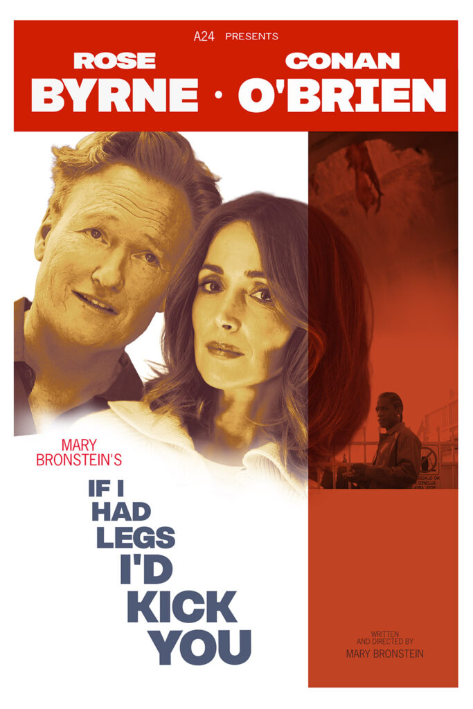
A movie that made me so glad I never had a kid. Two hours of unrelenting stress (complimentary).
Today’s base poster was chosen purely for similar title length.