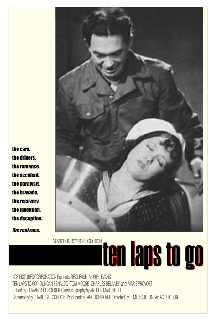
Tag: photoshop

  • Movie Pass Adventures: The Ballad of Wallis Island

    Tim Key and Tom basden in The Ballad of Wallis Island.
    Carey Mulligan and Tom Basden in The Ballad of Wallis Island.

    Charming. That’s what this film is. Gentle, but strong. Charming without being precious. It’s not afraid to follow standard movie plots, but it knows how to push them into new spaces. I was worried when I saw the trailer that Tim Key’s stream of consciousness delivery would be grating, but he knows when to pull it back and let his eyes do the acting.

    And the music holds up!

    My first thought for a poster was a Wallace & Gromit redo (Wallis? Wallace? GOLLY I AM CLEVER), but I realized making a fake poster for a sweet movie based on the poster for a different set of sweet movies was redundant. I did get as far as a rough logo, though:

    A partially complete poster for The Ballad of Wallis Island based on the Wallace & Gromit titles.
    I mean, I even found the right font.

    Then I went a different way, and picked a different movie about a very different island.

    A poster for The Ballad of Wallis Island parodying the poster for The Wicker Man.

    Fun fact: this is my 60th movie of the year.

    Fediverse reactions
  • Movie Pass Adventures: Death of a Unicorn

    Jenna Ortega wincing at an open unicorn mouth.
    Jenna Ortega in Death of a Unicorn. She is looking out in fear. She's colored in shades of red. The background is concentric circles in rainbow colors.

    If you said to someone “A24 movie about unicorns starring Paul Rudd and Jenna Ortega,” they’d probably guess about 90% of what happens in this movie.

    Originally I thought I’d do a riff on the Death to Smoochy poster, but then I decide to use one people might actually recognize.

    A poster for Death of a Unicorn parodying the poster for Born on the Fourth of July
    I like the way it looks like he’s screaming a rainbow.

    Fediverse reactions
  • Classic Movie Adventures: Man With A Movie Camera (1929)

    A man with a movie camera from Man With A Movie Camera.
    Man With A Movie Camera in a glass of beer.

    This is the most literal interpretation of documentary I’ve ever watched. It’s roughly grouped together by themes, but there’s no story. It’s mostly an excuse for wandering around Russia and finding cool things to film in innovative ways.

    There are many versions of this movie floating around. Fandango has a particularly janky print. Look for the restored version (I watched it on Kanopy).

    My first thoughts for the parody poster were a couple of Bond movies, The Man With the Golden Gun and From Russia With Love, but I didn’t want to jump back into Bond after the Goldfinger/The Italian Job mashup, so I went another way. It came out better than I expected.

    A poster for Man with a Movie Camera parodying the poster for Requiem for a Dream.
    Fediverse reactions
  • Retro Movie Adventures: Princess Mononoke (1997)

    San, masked, in Princess Mononoke.
    Ashitaka & San in Princess Mononoke.

    Princess Mononoke was one of those “I hear it’s great but somehow I’ve never seen it” films. The last Studio Ghibli movie I saw was My Neighbor Totoro, which has significantly fewer flying body parts and worm-covered demons. This movie is a prime evidence that “animated” doesn’t mean “for kids.”

    The film is lovely, and the 4K transfer is stunning. I’m glad my first experience seeing it was on the main screen at the Chinese Theatre.

    Today’s parody poster is dumb, but after the first scene with San, her mouth ringed with blood, this terrible idea came into my head and I had to go with it. It doesn’t quite work unless I explain it, which means it doesn’t really work at all.

    A poster for Princess Mononoke that just barely resembles the poster for Joker.
    “Why so serious?”

    Today’s bit of working too hard on a part of the poster that no one will notice: While trying to find a font that closely matched the title on the original poster, I found a reddit post from the person who designed the original logo. They said they used wood blocks to hand print the original, but they also suggested a very similar digital typeface. I slightly re-scaled each of the letters individually, and gave each one its own texture. You can’t tell.

    Fediverse reactions
  • Retro Streaming Movie Adventures: Monty Python Live at the Hollywood Bowl (1982)

    Terry Jones in Monty Python Live at the Hollywood Bowl.
    The singing waiters from the opening of Monty Python Live at the Hollywood Bowl.

    Some of this still feels brilliant, and some of this feels like stilted, racist schlock.

    Figuring out which poster to parody took forever, but when I figured it out it seemed obvious.

    A poster for Monty Python Live at the Hollywood Bowl in the style of the poster for Trainspotting.
  • Movie Pass Adventures: Ash

    Eiza González as Riya in Ash.
    Eiza González as Riya in Ash.

    This movie isn’t exactly Alien with extra gore and a big spoonful of David Lynch, but it isn’t far from that either. Not a movie for me, but space horror isn’t usually my jam.

    Another rushed poster, but that’s okay; I didn’t really feel much motivation to do something better.

    A poster for Ash that's a lazy ripoff of the poster for Alien. Seems appropriate.
    Fediverse reactions
  • Retro Movie Pass Adventures: Lost Highway (1997)

    Patricia Arquette and Balthazar Getty in Lost Highway
    Robert Blake as Mystery Man in Lost Highway

    Somehow, David Lynch’s Lost Highway is both more and less realistic than Hitchcock’s Vertigo. Body doubles, body switches, a Mystery Man who appears in multiple places at once, and a linear story told in non-linear time, but it’s still not as weird as a guy dressing up a woman to look like the woman who thought she was possessed by her ancestor and killed herself but then two or three other layers of unlikely weirdness happen.

    Also: it was fun to see Robert Loggia beat up a guy on the closed road I use to ride my bike to Griffith Observatory.

    Today’s poster was such an clear choice that I almost avoided it for being too obvious. Fun fact: The original poster featured an early example of computer graphics. Vertigo was actually the first movie to use computer graphics; Saul Bass used them in the title sequence and on the original version of this poster. They probably took days to render. I made my low resolution substitute in about five minutes with an online programming language for kids called Scratch. The part that took the longest was all the hand drawn lettering. There are Saul Bass homage fonts out there, but I wanted all the letters to be unique.

    A poster for Lost Highway in the style of the poster for Vertigo.
    Fediverse reactions
  • Movie Pass Adventures: Opus

    John Malkovich and Ayo Edibiri in Opus
    Ayo Edibiri in Opus. She is shades of red; the background is yellow and brown stirpes.

    Before I saw Opus I read an article that called it a spiritual sequel to another movie. Even though that wasn’t exactly correct, it was enough to suck most of the mystery out of the film. Also, the other film was better.

    One major difference between the two: the plot here requires all of the unknowing participants to act in very specific ways or the whole plan fails. It’s not exactly a brilliant plan if it could get wrecked by someone deciding to hide in a different room.

    Tonight’s fake poster is a bit of a rush job, but I think it references the original pretty well. Malkovich’s eyes don’t hold quite the same kind of menace as the originals, though…

    A poster for Opus parodying the poster for Amadeus
    Fediverse reactions
  • Retro Movie Adventures: Anatomy of a Murder (1959)

    Lee Remick wearing sunglasses in Anatomy of a Murde.
    Jimmy Stewart in Anatomy of a Murder. Just his head and shoulders. He is looking slightly to his right. He is rendered in shades of blue and cyan. The background is faint portraits of Lee Remick and George C. Scott, rendered in magentas and yellows.

    Man, trials in the fifties sure had a lot of joking around. It doesn’t matter if you’re talking about murder and rape; just saying the word “panties” is enough to get the whole courtroom giggling.

    I saw this at the Vista, which only shows movies on film. Last time I was there I saw a great 70mm print of Vertigo. This time, it was a 35mm print that looked looked like it had been stored in the basement of a truck stop. It was watchable, but mighty rough.

    Went with an easy, mostly text poster for today’s parody. The picture of Jimmy Stewart is pretty rough, so it matches well with the film print I saw.

    A poster fr Anatomy of a Murder in the style of the poster for Ferris Bueller's Day Off.
    Fediverse reactions
  • Movie Pass Adventures: Eephus

    Members of the Riverdogs baseball team sitting in the dugout in Eephus.
    Franny at his scoring table in Eephus. He is rendered in greens and golds. The background is a pixelated image of Soldiers Field and players from both teams.

    I don’t know anything about baseball, so you might think a whole movie about two small town teams playing a game wouldn’t work for me, but it’s a perfect example of how showing hyper-specific situations somehow makes stories more universal. I’m sure there are fans who could follow all the technical talk about playing, and who know what all of the symbols Franny marks in his playbook mean, but I don’t think actually knowing any of that makes the movie more enjoyable- which is weird, because I think including all of that stuff is crucial for making this movie work. My favorite detail is the team uniforms: everyone wears one, but none of them quite match. I mean, look at theseguys:

    And you know there were HUGE arguments over every new uniform design.

    This isn’t a movie about winning a game. It’s a movie about playing a game, living a game, and knowing that the game is going to end. It’s very bittersweet, but the sweetness is definitely there.

    Today’s poster challenge: Find a poster that somehow connects to a movie with a unique one word baseball-themed title, but isn’t a baseball movie. I ended up leaning into the single word title and the symbols in Franny’s scorebook.

    A poster for Eephus in the style of the poster for The Matrix
    Today’s thing I spent too much time on: creating the glitchy title letters. There are a few different “Matrix” fonts out there, but if I’d used them both of the E letters would have looked the same. And I wish I could have used two players from each team, but there weren’t many images of the Adler’s Paint team standing.
    Fediverse reactions